Two identity routes for a car wrapping & surface protection brand
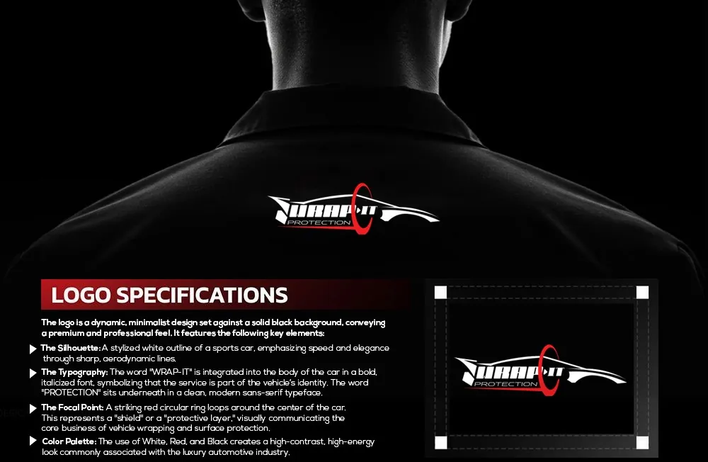
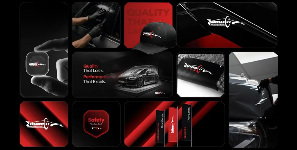
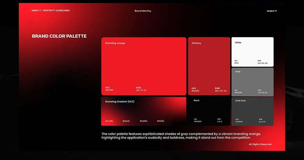
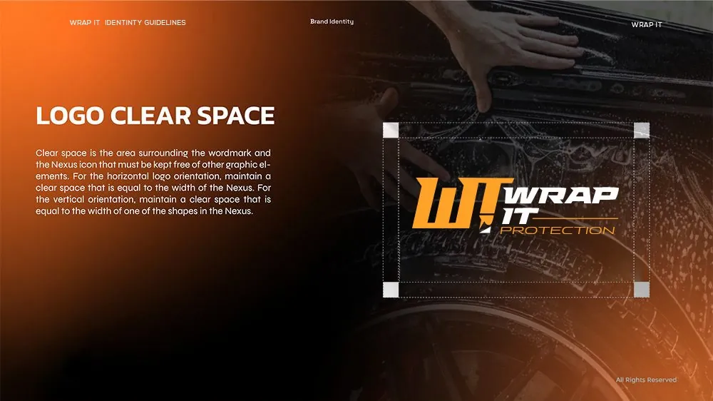
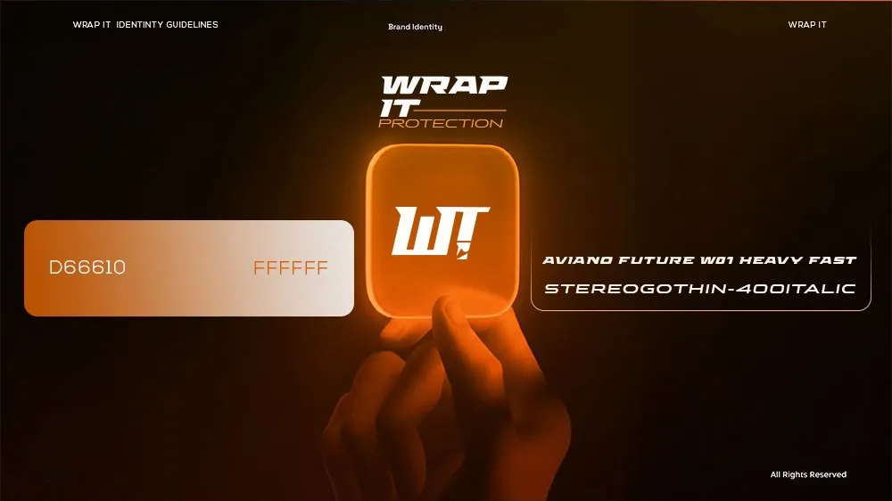
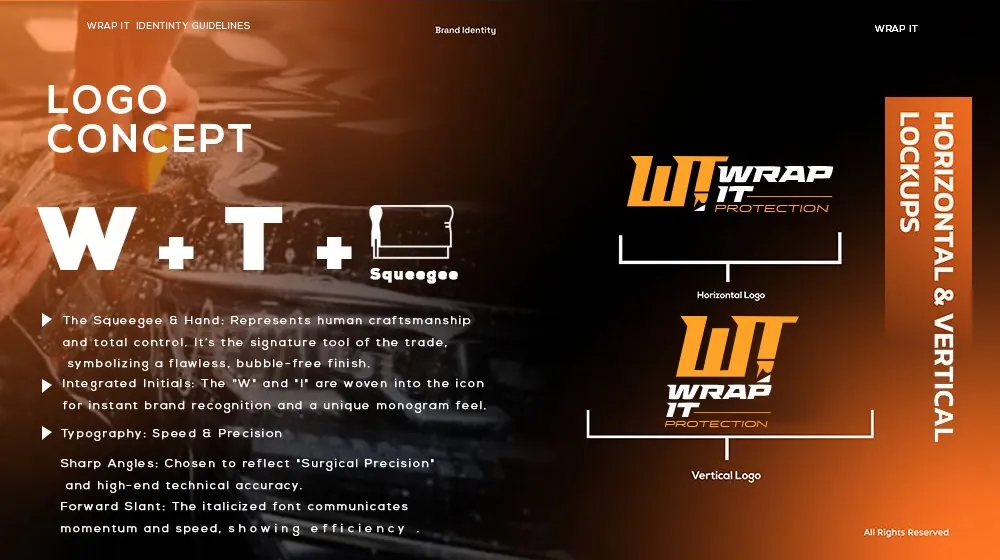
WRAP-IT Protection wraps and protects vehicles, so the identity had to feel fast, precise and premium. We developed two complete routes. The first draws a sports-car silhouette with the wordmark built into its body and a red ring looping around it — the protective layer made visible — in a high-contrast black, white and red palette. The second is a bold W + T monogram that folds in a squeegee, the signature tool of the trade, set in a forward-leaning italic for speed and a fiery orange. Each route comes with logo specifications, clear-space rules and lockups, and is shown on uniforms, caps, flags and social media.
Let's craft an identity your customers will remember.